A subscriber has just bought a house in South London with some swanky floor plan proposals and I’m giving him a 6/10.
He wants an open kitchen with the ability to close it off from the dining and living areas, so we’ll look at his open plan option with bifold divisions. Spoiler: we can be more interesting than this.
He doesn’t want the dining space to become the room they walk past eleven months of the year and use on Christmas Day, but the drawings are not giving me any hope that this design dilemma is even so much as a thought. Let’s tackle it here (for this subscriber and every one of you suffering from the same London semi layout).
The reason it’s so common is that most people design for what they think they’re supposed to have, rather than how they actually live. When they’re deciding on their dream home layout over a Zoom call with the architect, they’re thinking all about the “house tour” on a Saturday evening before dinner - not about the mundane Monday morning routine.
There is nothing worse than building an extension before you’ve figured out the best layout configuration for your home. Don’t you dare mark it “Dining Room” on the floor plan and call it a day.
You’ll end up with a space that looks good but is completely useless to you. If you get this wrong, your expensive extension won’t improve your life one bit.
Here’s how to avoid it →

Subscriber’s Home
1. Circulation dictates usage.
If the route through the house cuts directly through the dining space, that room will never feel like a destination. It becomes a corridor with chairs. If that’s what you’re going for then you can probably stop reading here.
In the proposed extension options, the dining zone sits between the kitchen and living room. The intention is sensible: centralise the shared meal space. The issue is that a functional dining room needs a purpose - the label is not enough.
The proposed plan turns it into a traffic zone. You will place items on the table, walk past it, and frankly you would be far more likely to pull up a chair at your unnecessarily large island for dinner after work. This dining room will get no love and it breaks my heart.
A room only works when its purpose and its boundaries are aligned. At the moment, it could go either way. Let’s get specific.

Subscriber’s Home
2. The lounge does the heavy lifting.
I’m starting with the strengths of the space.
In this case, the front living room is proportionally better suited for hosting: it holds a proper seating arrangement, has a focal point (the bay), and isn’t bisected by circulation. This is where coffee will be poured, and where downtime will occur. We are naturally more at ease when cocooned in a corner, so you’ll notice people gravitate towards snugs and lounge spaces. The central dining zone won’t naturally offer that feeling.
This means the dining room should not compete here. It should function as a flexible extension of the kitchen, or as something with its own clear and unique purpose (casual dining, working, homework, or hosting dinner parties) rather than a ceremonial room that you feel embarrassed about never using because you know that, deep down, it’s only there for show.
3. Don’t design for the “house tour”.
Dining rooms fail when they are designed for their rarest use case (holiday meals) and their most theatrical audience (visitors). Designing around Christmas dinner is how you waste space and money. Designing around weekday life is how you extract value.
Visitors spend two hours a week in your home. You spend the other 166. Design for the 166 and don’t be a diva.

(Leave house tours to Sabrina)
4. Figure out function.
Long rear extensions often become undefined rectangles - busy yet directionless. These spaces need at least one anchor point: island, banquette, ceiling drop, or material shift. In the plans shared, the island already anchors the kitchen. What’s missing is the counterbalance on the opposite side.
The two chairs proposed feel incredibly awkward. Nobody will ever use them, they provide an awkwardly-low viewing angle, flashing the underside of the kitchen island. Sexy. It would be better to allocate that wall for pantry storage, a bar, or built-ins to claim territory. If we can squeeze all the kitchen-related function into the main kitchen space, it frees up our dining zone for something a little more flexible and playful.
We need to create a reason to enter the room.
5. Dividing the space.
There are multiple ways to close off a space:
pocket doors
glazed partitions
sliding panels
cabinetry-based room dividers
Glazed partitions are popular because they preserve light, but they often look industrial or hyper-contemporary in houses that are anything but. Pocket doors are the neatest solution when wall thickness allows - full flow when open, full acoustic separation when closed. Bifold doors between two interior spaces is not something I personally propose: they’re clumsy, they take up space, and there are better options.
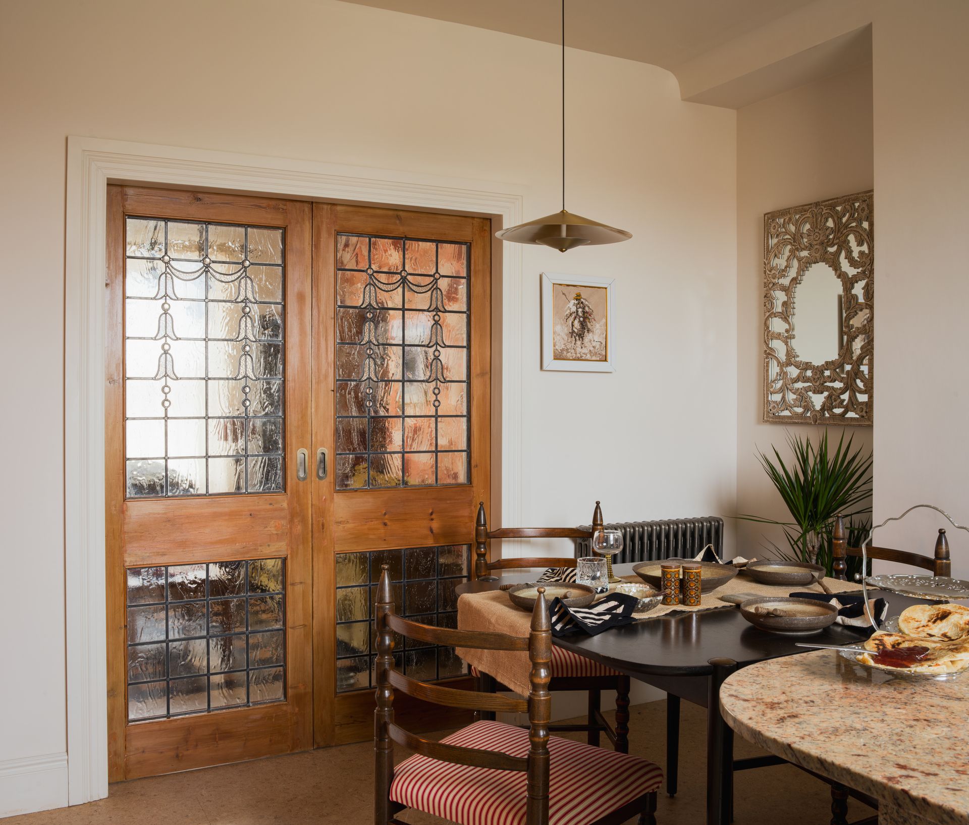
Given the depth of the extension, pocket doors make the most sense here with a few architectural tweaks. They allow the kitchen to be loud and messy when required, and invisible when not. They can also be made beautiful and intentional rather than treated as hardware.

‘Undressed’ by JANAYE Studio | byjanaye.com (photography by Vigo Jansons)

‘Undressed’ by JANAYE Studio | byjanaye.com (photography by Vigo Jansons)
6. What I would do.
I want this dining room design to encourage daily use. It should feel connected to the kitchen, cozy enough for daily family meals, casual enough for WFH and flexible enough to ‘dress up’ for the dinner party.
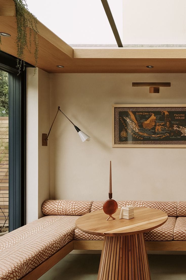
Banquette seating and some unique shelving would work well here. What this layout is missing is a dining snug - and who says that the snug can’t also serve as all of the above?

Design by Ondine London
Adding in pocket doors would mean that the space could be completely open or completely closed, depending on the occasion. I would use this as a design opportunity for some really interesting doors. Maybe the glass brings colour into the space - pattern, or texture.

‘Play House’ by JANAYE Studio | byjanaye.com (photography by Vigo Jansons)
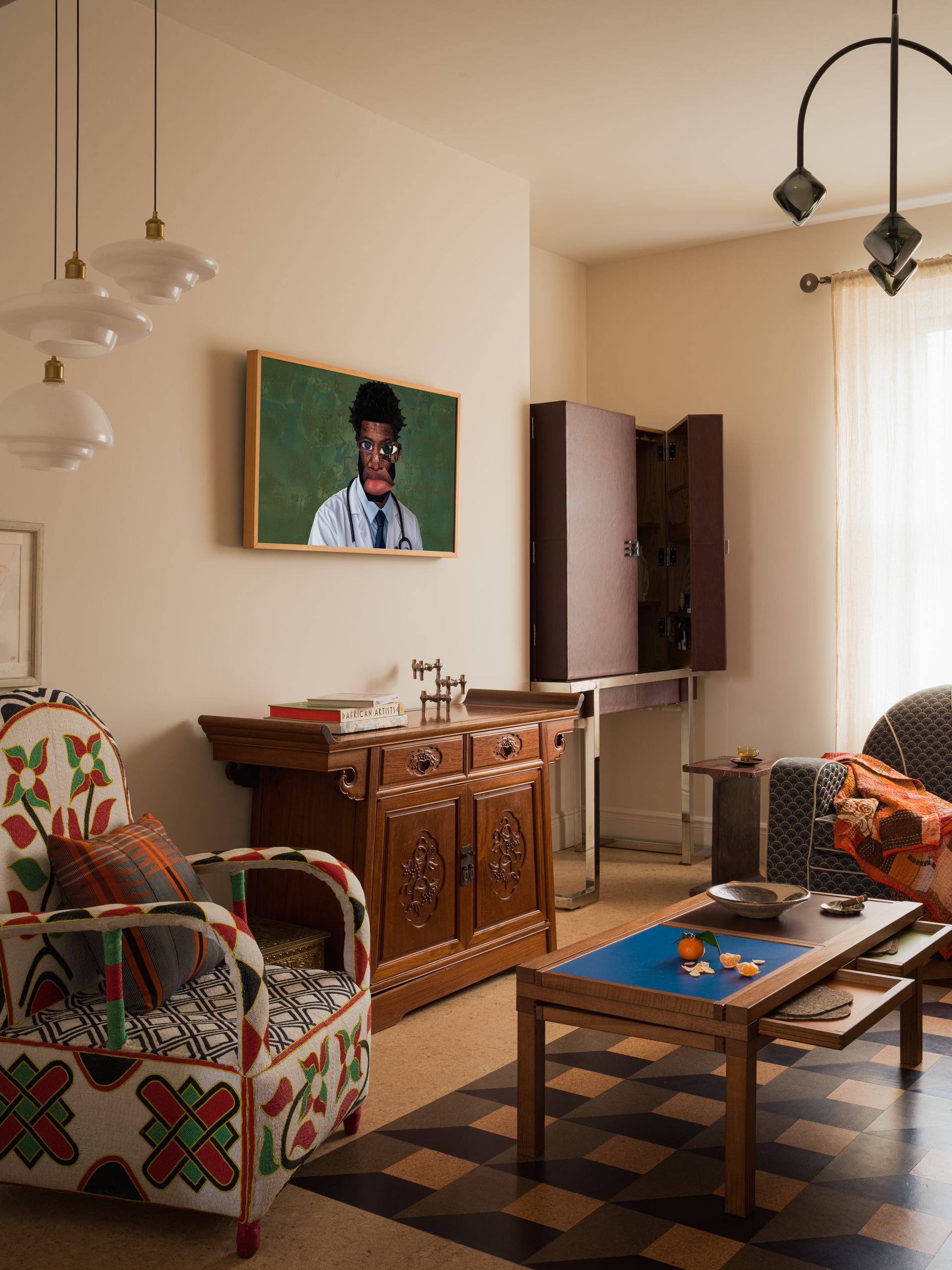
I would make this a space to store things that are personal to you. Books, artwork, photographs - anything that could make this space feel like the heart of the home (exactly as it was intended to be!)

Source Unknown
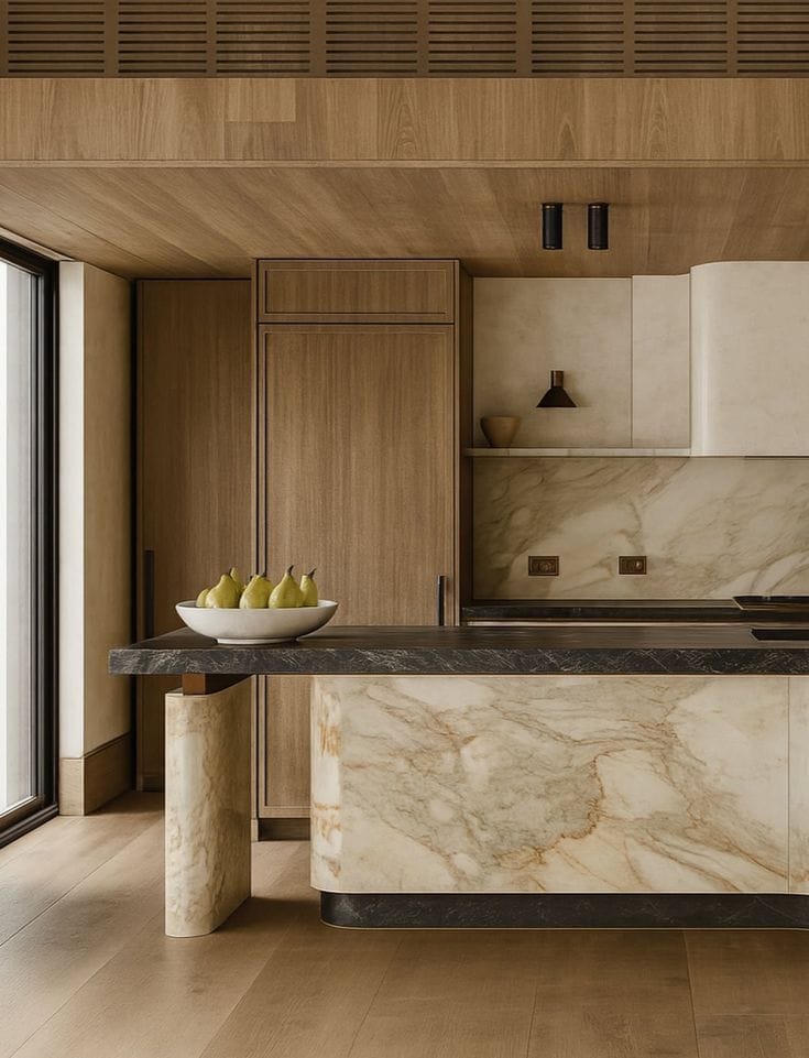
The kitchen island needs some interest and variation. It’s a little too long and the orientation is odd, although it may be making the most out of a garden view. Explore elements such as multi-level and split islands to break up this ‘block’, and be more creative with the back of the kitchen area. This space is calling out for a pantry.

Source Unknown
Thanks for being a part of my little newsletter community and remember you can send in your space for some home truths! Safe space.


