Hey guys,
Still new to this. Shall we do once or twice a week? I’m sending you a poll after this so please vote and let me know.
Today we’re focussing on tiled walkthroughs (including how to do them and my favourite tiles for this feature), bookcase styling for realistic homes and statement hallways. If that sounds like something you need in your life then keep reading. If you’re supposed to be at work then save it for your lunch break.
Some of you may have seen my recent post rating this space for a lady who wants a classy, personality filled home.
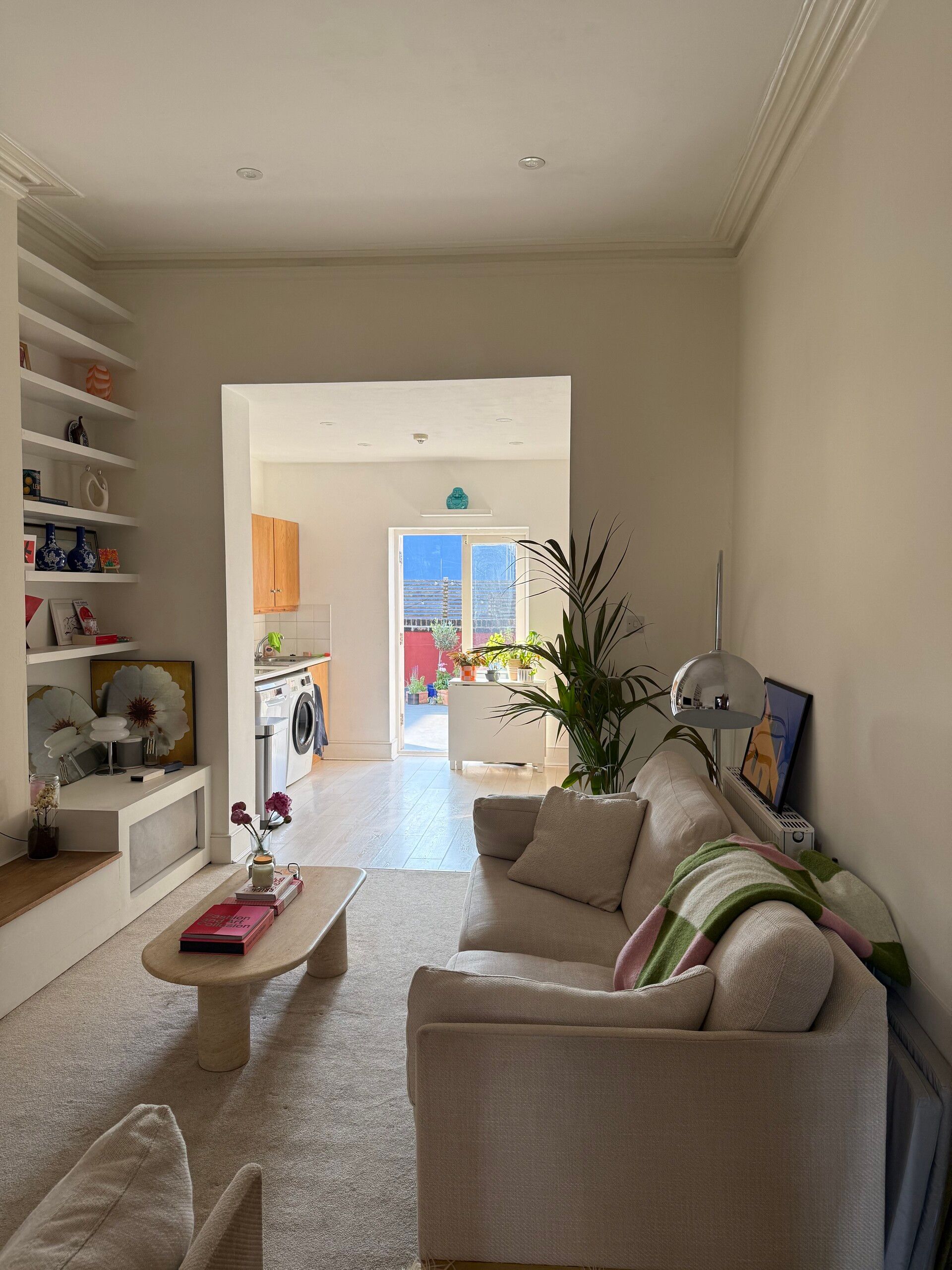
Subscriber's Home | 6/10 Bee-rating
She told me that she has thrifted many of the pieces, which I absolutely love. We talked about two major elements on TikTok, which I’ll delve into in a little more depth for you guys. Trust me, these are easy ways to take this space from a 6 to a 10, and they require minimal effort so even lazy renovators can join in on this one.
Tile the Opening.
This is the perfect way to add interest to the space without doing too much. It’s so easy that you might even be able to do it yourself, and it works for both minimalistic spaces that need a little lift, like the example below:
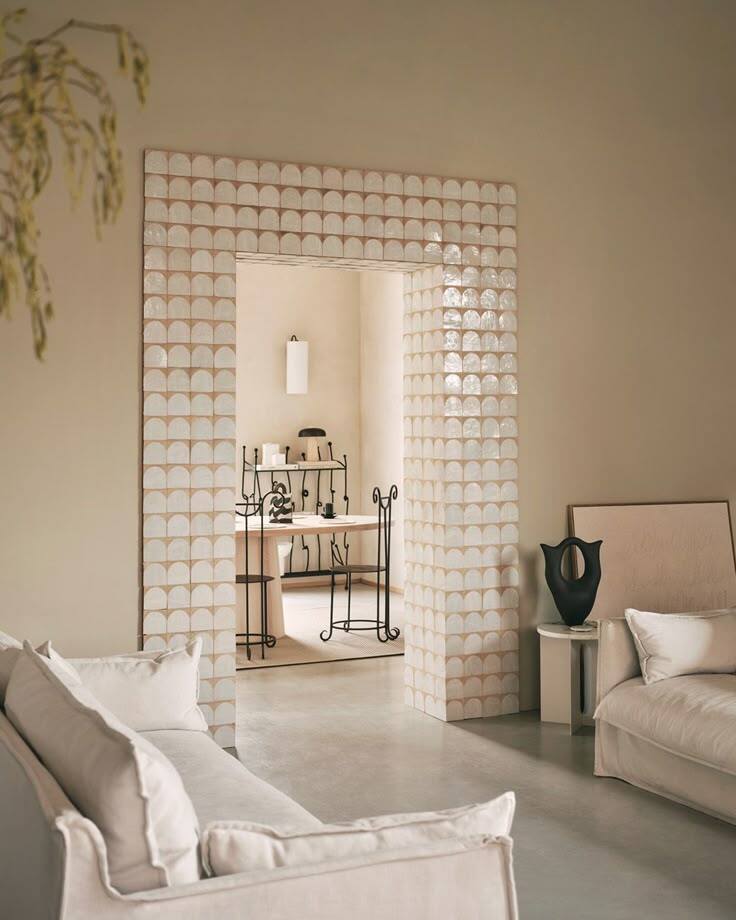
White Arch Terracotta Zellige | Otto Tiles & Design
and for more eclectic spaces in need of a transition feature:

Designer Unknown
Get the look:
Pay attention to the scale of your space to determine the border thickness. If you’re working with low ceilings and your doors are close together, you might want to select something that is more of a slim trim detail, or just actually tile the internal walkthrough section of the wall (rather than the face of the wall). It will still give a glimpse of interest from the right angle.
Consider a skirting tile in one room. It’s brave and fun, and it can lead you nicely into a feature walkthrough like this.
Select a tile that really works for your scheme. If you have a flat space, consider something with a glaze, just for textural contrast.
Think about the thickness of the tile, as you will have a raw edge where it meets the wall. The thicker the tile, the more visible the raw edge.
Tiles I love for this detail.

White Arch Terracotta Zellige | £155.00 /m2
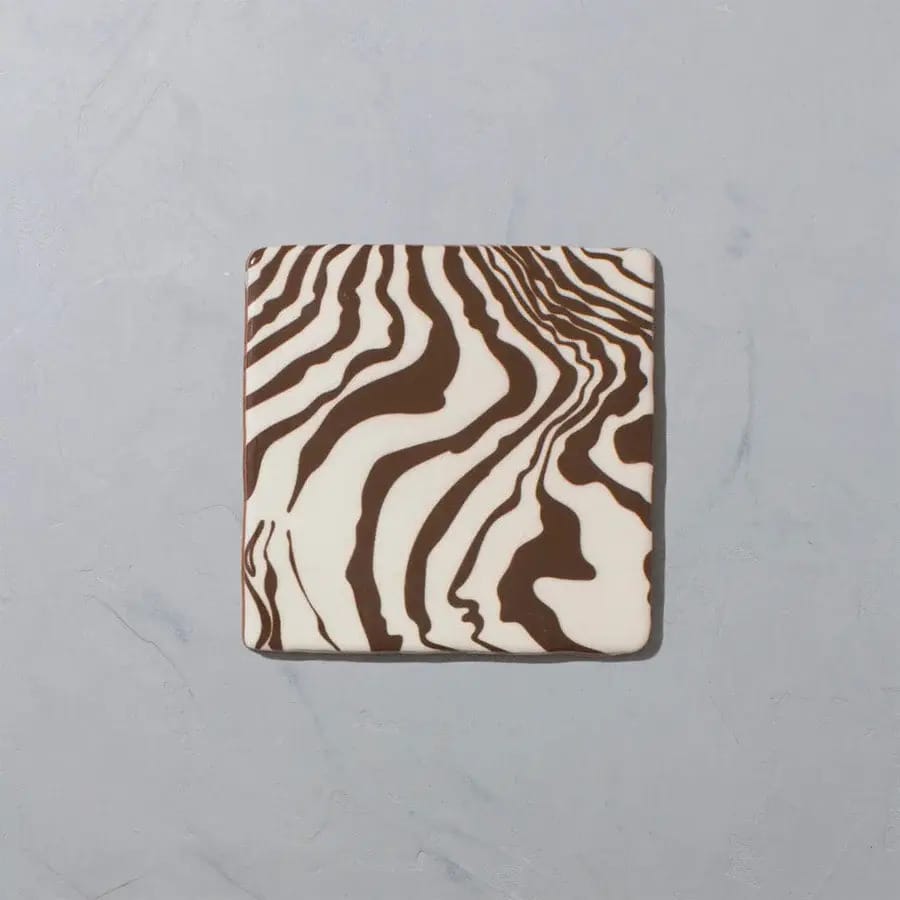
Henry Holland Studio Pour Brown Glazed Square Tile / £120.00 /m2

East Village Porcelain Oro by Ca’Pietra | £89.00 /m2
Style the Bookcase.
Controversial. Some people hate a designer-styled bookcase in a home, so let’s look at examples of realistic homes with CURATED bookcases.
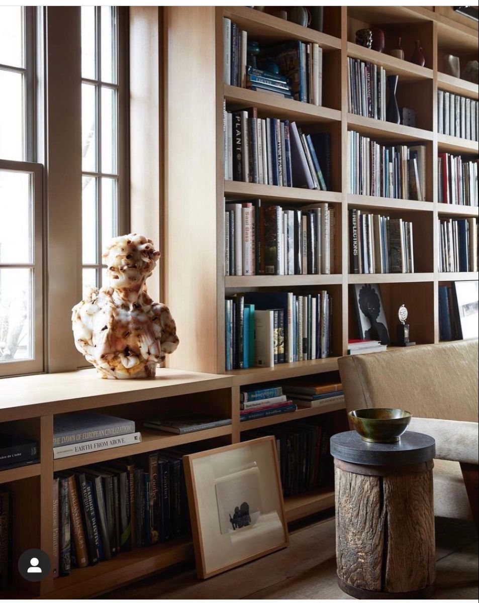
Designer Unknown
Look, I’m not saying drop the books. You can have a home bursting with your book collection and still be stylish. The best way to do this is add in a few pieces of art (especially small pieces which could almost act as divisions and hide some of the more unsightly piles that don’t quite perfectly perch on your shelf). Adding in small decorative items for a visual break is another way to make your library shelf look curated.
Some of you will simply prefer a more paired-back aesthetic. This is going to create a calmer space, and we have to be honest about how visual clutter can impact our lives. For those of you who are nodding along to this, you might be more inclined to style your shelves like this:

Orient House Design | Sydney
Still functional. Just a little more paired-back. We achieve this by stripping back the central bookcase in the house (the one you sit and stare at the most) to only hold your most important books. The ones that you are ACTUALLY reading. Then, we’re going to add in even more simple but sculptural styling pieces to pull it all together. In this version, we’re really going for visual variation, a little negative space and ultimately: something that feels good to look at. Nobody said that you have to have all of your books on display at the same time.
Dark-Drenching and Dramatic Hallways.
Finally, I promised that I would talk about the dramatic dark-drenched hallway. The plot twist that earned this lady a 6.
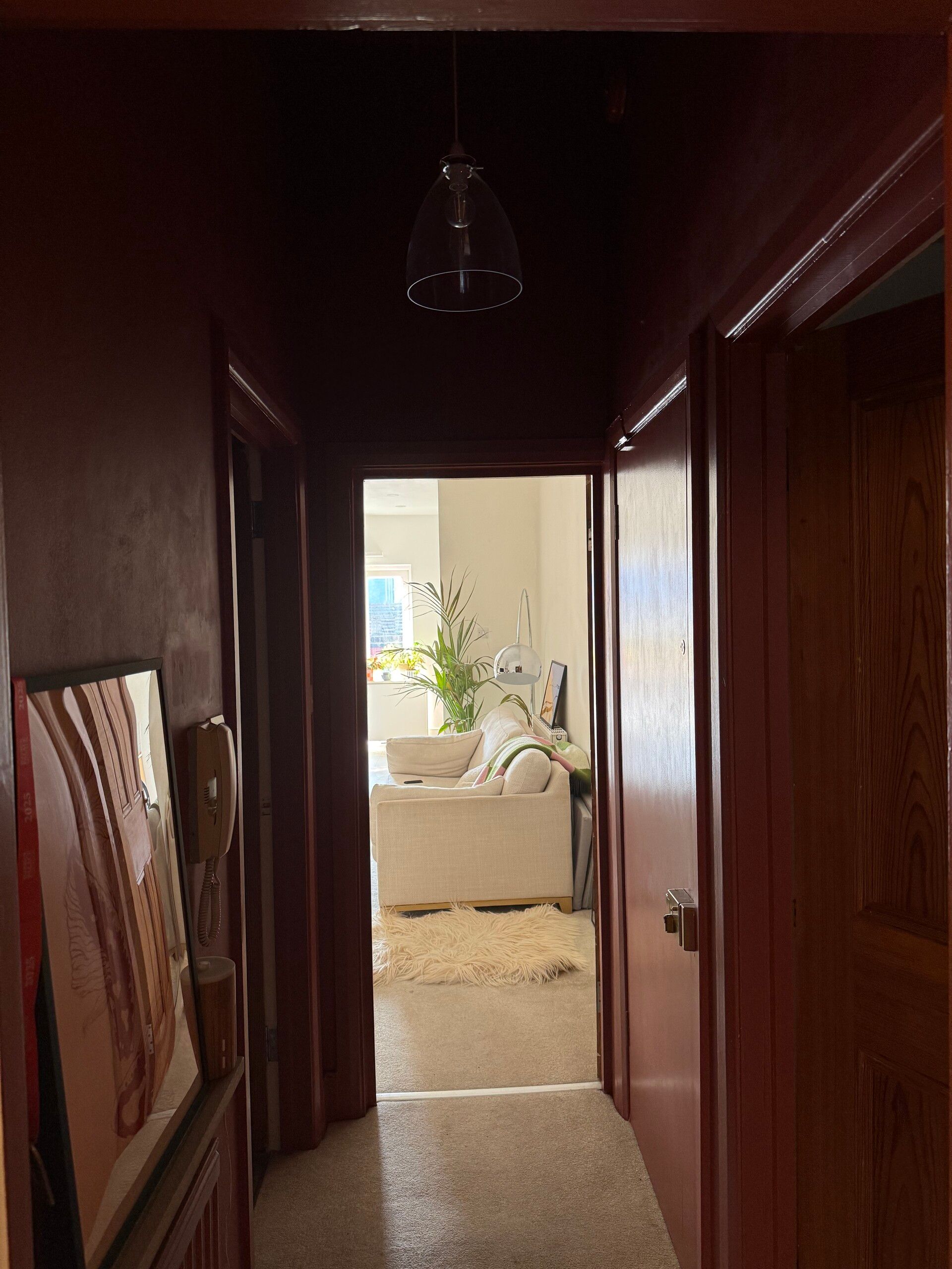
Subscriber’s Hallway
Now we’re talking.
Let me influence you to add drama to your hallway.
I’ve talked about it time and time again: your entrance is the first thing that people notice when they enter your home. It really is the tiny show-stopper which is so often overlooked, and it makes me sad.
But - there are two things missing from this hallway. Can you guess what they are?

Anyszka Studio | Warsaw Apartment
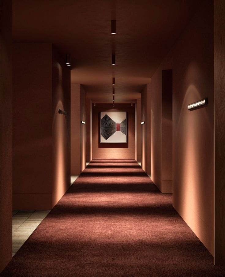
Hecker Guthrie | Hyatt Centric Melbourne
Visual focus
Complimentary lighting
In the apartment example, we can see the tiny pop of red introduced by the footstool at the end of the hallway. It draws your eye past the narrow hallway, all the way to the end. It introduces the scale of the space, and forces you to take in all of the detail on the way. It also creates a sense of balance over the one-sided wallpaper on the right and the artwork on the left - despite their asymmetrical placement - we are rebalanced by an ‘end point’.
What could your hallway ‘end point’ be?
In the Hyatt hallway, we have a beautiful example of how lighting is the finishing touch when it comes to a dramatic hallway. I love the ‘spotlight’ feel in dark-drenched spaces, where it casts interesting shapes and shadows which makes walking through the space feel like more of an experience. We also have lighting in unexpected positions - more spotlights washing the left hand side wall so that we can peep the switches. Practical and aesthetically interesting. Tick, tick.
In our subscriber’s example, the glass light fixing seems to almost disappear into the ceiling. Let’s cast some real directional, dramatic light instead.
That’s all for today guys, but I hope that this gave you some good tips for your first, not forever home.
Who’s next?
Send me your design dilemma and I’ll deliver the home truths.
