Open-plan spaces fail for one reason more than any other: poor zoning.
Last time I talked about spatial planning I had lots of complaints that I didn’t show you what I would do. So, this time I’m doing exactly that (my olive branch for the delayed weekend email).
This subscriber wrote in about a new apartment which she had purchased and an intended layout in mind.

Subscriber’s Home
“TV I’m thinking should be on the other wall in front of the TV sockets, with sofa opposite the tv and chair where they have got the sofa.” →

Subscriber’s Home
So, I’m imagining that she means something like this:

Proposed Layout
I’m giving it a 5/10 because I don’t want to walk into the back of your sofa unless we have a tonne of space and some interesting design elements to distract me from the fact.
Let’s try again.
Tweaking the architecture (without doing too much)
Let’s look at the bones of the space, since we don’t have too much flexibility to change them in this Grade 2 listed building. The kitchen area is a bit of an eyesore, and I’m not talking about the cabinets. I’m assuming that part of the problem is structural, but it’s a very non-committal space. Open-plan or closed off? We’re not really sure and I don’t think that the previous owners were either.
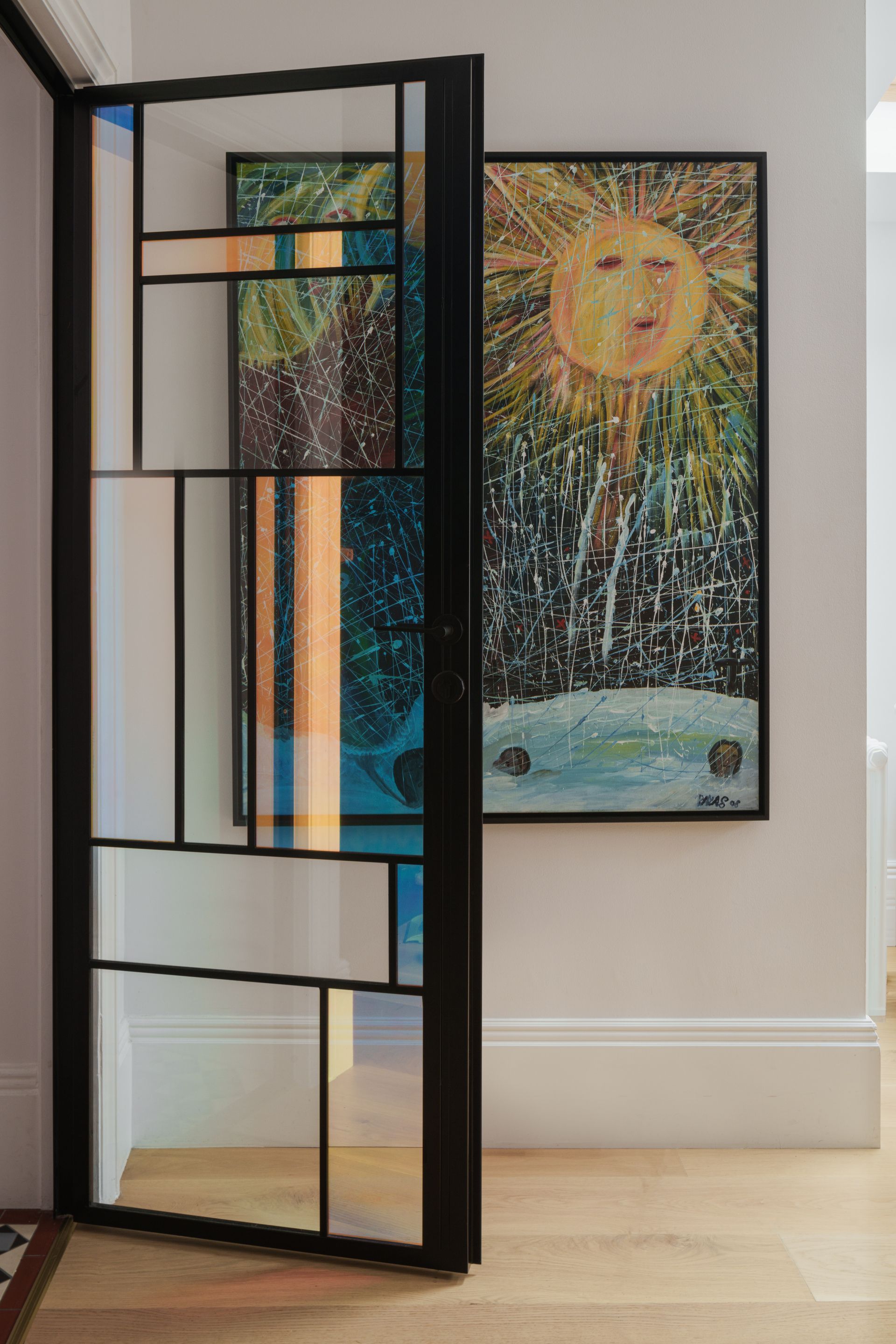
I would definitely start by doing something about that. Some kind of sliding glass division would do the trick, and it would still leave the space feeling open. I would work on this division and see how you can add detail to the space instead of ignoring the transition into the kitchen altogether.


Making Glazing Interesting - ‘Play House’ by JANAYE Studio
We’re also going to consider what I would call the ‘soft architectural opportunities’ in the space. The subscriber has already mentioned that they will be switching the curtains out for something full length, and while that will make a huge difference, there is something else that we could do.
Pulling the curtains across the entire width of the space is such an easy way to change the dynamic. I think that this would be the perfect opportunity here to create a much more impactful space. It will also:
soften the room acoustically
exaggerate the ceiling height
visually unify the elevation

Heating the space
We have to address this because I know that your radiator position has so many of you in a choke-hold and it really needn’t. Yes, we’re working with a listed building, but for this lounge to work we are going to have to figure out new locations for those radiators because they are pretty poorly placed.
I assume that the current positionings are dictating the subscriber’s intended layout for the space and I can understand why. Before doing anything to the walls she’ll need to use 1000 grade liner paper, and moving them is out of the question.
Of course, for upgrades in this building to be approved they need to be demonstrated as discreet and fully logged. You’ll essentially need permission from the local planning authority and I know it feels like a burden but my opinion is that it’s worth it here.
Assuming the best case scenario outcome of approval, I’ve placed a longer rad under the window to heat the whole room evenly.
Ideal layout solutions
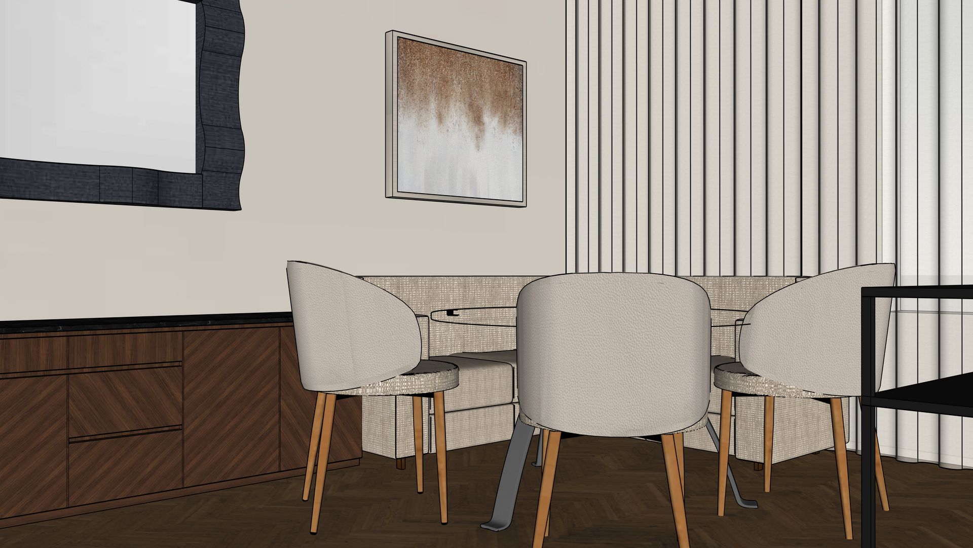
You’ll see that I’ve flipped the layout around from the intended and created a nice dining nook in the corner.

Proposed Floorplan
We have to design for human behaviour. Humans gravitate towards:
natural light
window-adjacent seating
snug, semi-enclosed spots
This layout leans into that instinct. By creating multiple seating options near the windows, we get flexibility, intimacy and a variety of experience within one room.

You now enter the space into the lounge, not into the back of a sofa. We want to make sure that people immediately feel comfortable and know the intention of a space when they enter it.
We’ve tackled the back of the sofa with a console table and zoned the space with a nicely-sized rug.
This layout deliberately zones the room into three clear experiences:
a welcoming lounge on entry
a defined dining zone
a visually softened kitchen edge

I’ve added in a room divider for charm because I would love to hide that TV so that it doesn’t become the centre of attention at the dinner table.

Each zone has a purpose. None of them bleed into each other by accident.
The biggest mistake in the original layout was allowing circulation to dictate furniture placement. In this plan, circulation is designed, not tolerated.
Using lighting to zone
The final - and arguably most important layer - is lighting. This will do the real work here.
If I were to design a lighting plan for this space I would make sure that the plan creates two distinct lighting zones:
a dining zone that can be visually “switched off”
a lounge zone designed for low, layered evening light
Within each zone, there should be multiple levels of light:
ceiling
mid-level
low-level
This allows the dining area to disappear visually when you want a snug, calm lounge experience without physically closing anything off.
That’s the difference between lighting for atmosphere and lighting for control.
The Real Success of This Layout
This design works because it’s decisive.
It doesn’t try to please every version of open plan.
It doesn’t apologise for zoning.
And it doesn’t let constraints dictate mediocre outcomes.
It understands how people move, sit, gather, and unwind you (and it designs around that).
Thanks for being a part of my little newsletter community and remember you can send in your space for some home truths! Safe space.

