This week’s subscriber asked a fairly simple question:
“How do I create a more interesting looking bookcase? I’m planning on creating a reading nook in my living room but I don’t want a standard bookcase as it will look bulky and out of place next to the TV. I want to find an interesting way to display my books and maybe some trinkets too.”

Subscriber’s Home
Listen, our issue is rarely with the bookcase.
The problem lies with balancing visual weight. Especially when the bookcase sits next to a TV, which, if you’re living in a typical UK home, is often the case. The moment that you place a standard tall bookcase beside a television, you create competition. Two vertical anchors fighting for attention. One black rectangle, one heavy block of shelving — neither particularly complimentary to the room.

All of a sudden the space feels bulky, cluttered, or slightly off balance. Do we add something above the tv to rebalance? Or clad the TV wall in the same finish to create continuity?
Before we’ve even had the chance to reconsider, we have ourselves a media wall. You already know how I feel about that.
So before we talk about styling, we need to shift the question. This isn’t simply about finding a more interesting bookcase, it’s about reinventing the bookcase entirely. Let me broaden your horizons by reinventing the Billy bookcase.
Today we have been sent a concept, and I’m pretty impressed.

Subscriber’s Concept
I’m giving this space a 7/10. The coffee table and little wall light above the chair need to be switched out, but I can see the vision here. Most importantly, the subscriber has tackled the core issue all by herself by incorporating a bookcase with a curved top and an oak back. It’s not the most original solution, but it’s definitely softer and it’s an attempt. I’ll take it.
Why Standard Bookcases Fail
Most bookcases are designed like standalone furniture.
Tall. Rectangular. Dense.
They assume they are the main event. But in a living room, particularly one with a TV, they’re rarely allowed to be. When you add a traditional upright bookcase next to the television, you increase visual height without adding softness. The result is a hard vertical edge that feels heavy rather than integrated, which explains why they often look out of place.
Depth is the other elephant in the room. Most off-the-shelf freestanding bookcases are 40cm deep, allowing for your chunkier hardback books to stand but eating up your space at the same time.
Let’s snap out of it: a 25cm depth is sufficient for 80% of your books, and the larger ones can be styled to work with this depth too. More on that later.
Here are some other things that we can do:
1. Lower Bookcases
One of the simplest shifts is moving the visual weight downward.
A lower bookcase:
keeps sightlines open
avoids competing with the TV height
creates space above for art or lighting
It reads more like architecture than furniture.

2. Colour Drenching
If the shelving blends into the wall colour, it stops reading as separate furniture.
Colour drenching allows books and objects to feel curated rather than stacked.
It’s a quiet way to make shelving feel intentional.

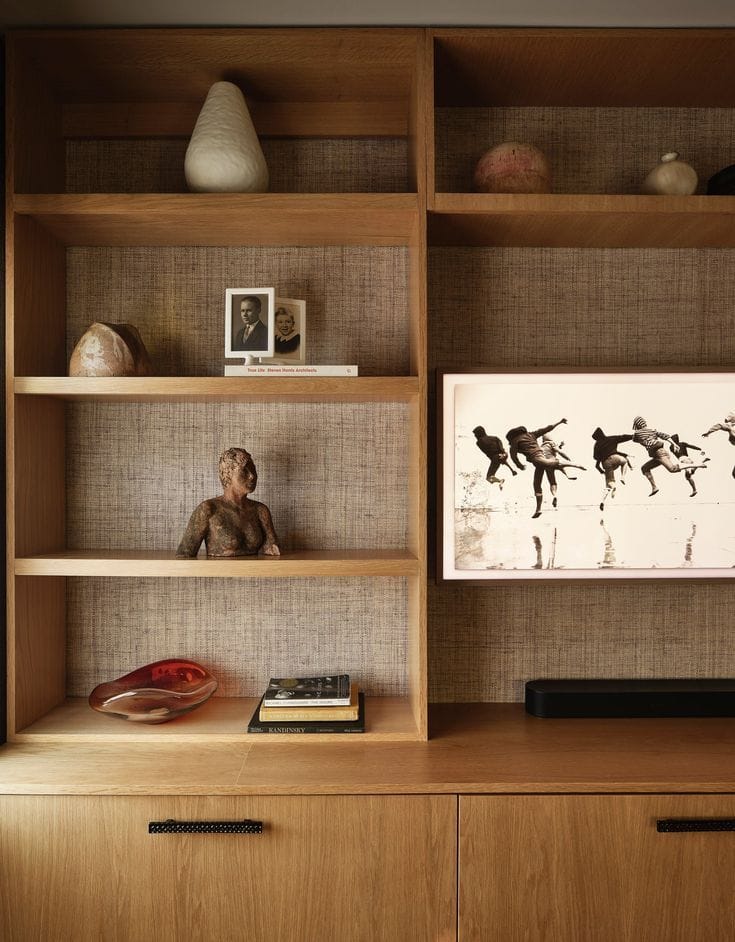
3. Wallpaper-Backed Shelving
Backing shelves with wallpaper or fabric instantly changes the reading experience.
Where I would argue that the black bookcase chosen by the subscriber perhaps has a bit too much contrast (therefore contributing to the ‘bulkiness’ issue), letting the shelves blend into the background whilst adding interest through texture would be a warmer approach. It creates depth and gives the eye somewhere to land between objects.
This works particularly well in reading nooks because it adds intimacy without clutter or a jarring contrast.

4. A New Canvas
This is one of the most underused techniques.
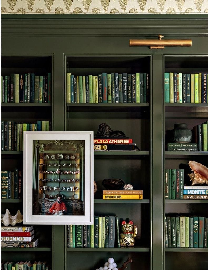
Hang artwork partially overlapping the shelving. This is my favourite trick to squeeze some secret ‘messy space’ onto an open shelving unit, since everything you store behind the artwork piece will never be seen anyway.
Lean pieces. Layer frames.
Suddenly the bookcase becomes part of a larger composition rather than a storage solution, and the perfect backdrop for a reading nook.

5. Back to the Drawing Board?
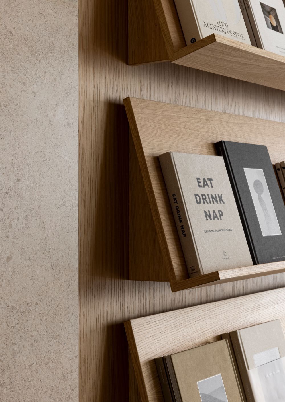
Consider floating Ledges Instead of Shelves. Picture ledges or slim floating shelves create rhythm without bulk.
They allow books to face forward — which feels more gallery-like and less utilitarian. This is best suited for those of you who have alternative storage locations for the bulk of your books, and only need a place to perch them for access from your reading nook.

6. Asymmetrical or Modular Layouts
Perfect symmetry often feels static.
Mixing shelf lengths or creating staggered arrangements introduces movement and interest without needing dramatic styling.

7. Style Intentionally
I know that the bookworms hate this one.
Embrace negative space: not every shelf needs to be full. If it’s forming part of the backdrop of a central living space, you need to keep control of your open storage.
There is a way to achieve this whilst still allowing intentional storage for your books. Play around with the orientation of the books and reserve a few shelves for stacked displays.
Empty space allows the eye to rest and makes objects feel intentional rather than accumulated.

Designing the Reading Nook Itself
We gravitate toward spaces that feel slightly enclosed. A successful reading nook isn’t just a chair beside shelves, it’s:
layered light
nearby surfaces
softness underfoot
visual transition from the rest of the room
Shelving should support that feeling, not dominate it.
The subscriber has made a good start by showing the intention of a wall lamp over a chair. Only, I would argue that it’s not enough.
If it’s not too late, I would switch the wall lamp for a small off-centre pendant.

Interior Design by JANAYE Studio
It demands intention and gives your reading nook presence. Your eye will naturally be drawn into the corner, and that is exactly what we want here.
Interesting bookcases aren’t interesting because of the shelves themselves.
They’re interesting because they stop behaving like furniture and start behaving like architecture.
And that shift — from object to environment — is where the magic happens.
Thanks for being a part of my little newsletter community and remember you can send in your space for some home truths! Safe space.
(by submitting your space for consideration, you agree that any images shared may be featured within the newsletter and across associated social media platforms.)
→ If you need a 1-to-1 session email me to ask about my virtual consultations.

